Tuesday, November 20, 2012

How Symbolic.


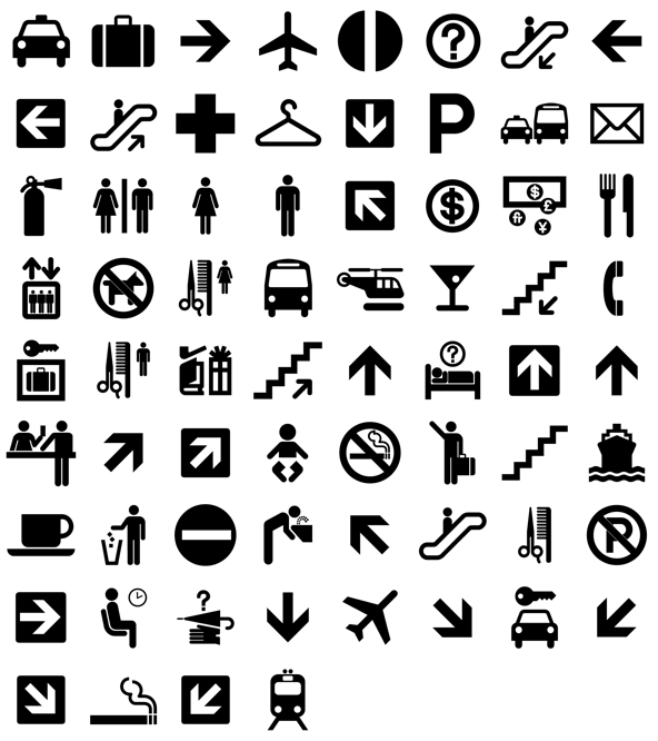
The “International Typographic Style,” is discussed in chapter eighteen of Meggs’ History of Graphic design as a typographic style, derived from Swiss designers, which influenced design across the Western World. However, this typographic style did not communicate across a truly international audience without the introduction of pictograms.

Originally introduced during the Bauhaus were Gerd Arntz and Otto Neurath’s isotype pictographs. These pictographs used simple symbolic images used to convey certain amounts and types of people in graphic manner. In the way they were used, a supplemental text was needed in order to show the context of the information presented. With influence of modern design including Bauhaus and the Swiss’ International Typographic Style, the United States Department of Transportation commissioned the American Institute of Graphic Arts in 1974 to create a set of symbols, which could transcend language barriers. A true international visual language was born from this project and can be seen all over the world, with slight modifications to accommodate differences in languages. The Olympic Games have also repeated the use of pictographs in order to surpass language barriers by having symbolic images represent different types of sports. 
National Parks Symbols
Department of Transportation Symbols

The use of the pictogram is ever so present in our modern society. We are bombarded with them on a daily basis whether we go to the airport, school, or the mall. We find them as icons on our “smart phones” and as playful images on t-shirts. They are easily recognizable and quick to register in our brains, but is this really a good thing? Could the constant use, or over use of pictograms be dumbing the population down?

 
Mike Judge is a writer and animator most notably known for his creation of Beavis and Butthead on MTV. He also created the well-known animated sitcom, King of the Hill. In 2006 Judge wrote, directed, and produced the movie, Idiocracy, a satirical comedy that explores the idea that only stupid people are breading. The protagonist, played by Luke Wilson, awakens in the future to find that he is the smartest man alive when in his time he was simply average. This future world in is plagued by advertisements catering to a population of invalids and in a scene in which he visits the doctor’s office, the nurse hovers over a keyboard with pictograms of a series of ailments. The images are hilarious as some of the ailments indicate death, yet the idea that person needs little intelligence to interpret them seems pretty dismal if this is the future.

Scene from Idiocracy 2006
 Sources
Meggs History of Graphic Design
AIGA
lardbiscuit.com
IMDB
wikipedia.org - Mike_Judge 

Tuesday, November 13, 2012

Secret Identity, Bauhaus Style


In chapter twelve, Meggs’ History of Graphic design introduced the early developmental stages of branding and marketing with an overall cohesion throughout in the identity of AEG (Allgemeine Elekrizitätz-Gesellsschaft) designed by Peter Behrens in 1908.  When looking at the majority of his pages, pamphlets, posters, and other paraphernalia of AEG, there is a clear and distinct look and feel that is consistently portrayed through and through. Behren’s Roman style font, designed specifically for AEG, and the use of the circle contained in a box and echoed from page to page. This played a crucial role in corporate identity overall and pulled away from confused designs of the prior century. What was curious to see was the handling of corporate identity when modern art began to grasp the world and how branding was handled when there was a broader spectrum of information to be delivered.
Logo and poster designs for AEG by Peter Behrens, 1907
Gyorgy Kepes
The Container Corporation of America (CCA) was founded in 1926 by Walter P. Paepcke out of Chicago, Illinois, by uniting fourteen smaller paper box and container manufacturers. Employing Egbert Jacobson as art director in 1936 and often commissioning influential designers and talent such as Herbert Matter, Herbert Bayer, A.M. Cassandre, Lázló Moholo-Nagy, Jean Carlu, Fernand Léger, Gyorgy Kepes, CCA lead the way in corporate graphics for packaging, logos, posters, publication, and advertising. The company was in business until 1968 when it was merged with the merchandise company, Montgomery Ward. 

As a packaging company, CCA had to advertise directly to other companies and create and identity for themselves. Armed with modern design aficionados from the Bauhaus proved to be prolific in interesting in the handling of branding and advertisement. 

Container Corporation of America 1943
Herbert Bayer
CCA ads were very modern for the times, purposeful, and constructivist in nature. The images produced almost always used symbols to convey ideas as well as the function of their product and while none of the designs could be considered similar, their Bauhaus and constructivist influences unite them. Another mainstay and consistency about the designs which would inherently “say” CCA is on each CCA advertisement box container exists. The box may be closed, open, with a smaller container next to it, or multiple containers next to it, but it always exists on the page with a three dimensionality to it. This three dimensional, high contrast box was Container Corporation of America’s trademark.
Toni Zepf 1938

A.M. Cassandre, c.1940
 However, Unlike Peter Behren’s AEG Identity, CCA seemed to lack a specified font for the wordtype. The only consistency here is that the words, Container Corporation of America, appeared in all capitals in a san-serif font.
CCA’s 3D box logo continued in use until it was redesigned by Jacobson’s art director successor, Ralph Eckerstrom, in 1957. The new logo showed “CCA” inside a box that could be seen as opening up to the left or down to the right in a dual perspective. 

There is a large catalog of CCA advertisements if just Google Container Corporation of America. Here are a few I found interesting:
Sources
Meggs’ History of Graphic Design
Oxford Dictionary of Modern Design


Tuesday, November 6, 2012

Post your Poster

In light that today, November 6, 2012, is election day here in the United States, I saw it fitting to seek out campaign posters of the early 20th century.

The States were somewhat late to game when it came to the European modernists ideas of design. Meggs states, "a visit to America in 1923 excited [Lucian] Bernhard, and he returned to live in New York. His [Plakatstil] work was far too modern to gain acceptance in America." This is nearly two decades after the modern movements in art and design had already begun. But in some of the poster work you can still see some of trickling in of modern design.

In Meggs, we see one example of the European poster design influence in James Montgomery Flagg's military recruiting poster (1917) where it is a clear copy of Alfred Leete's recruiting poster (1915). But, these would not be considered examples of modern designs they do, exhibit some qualities such as simplified designs using a short slogan with a single image.


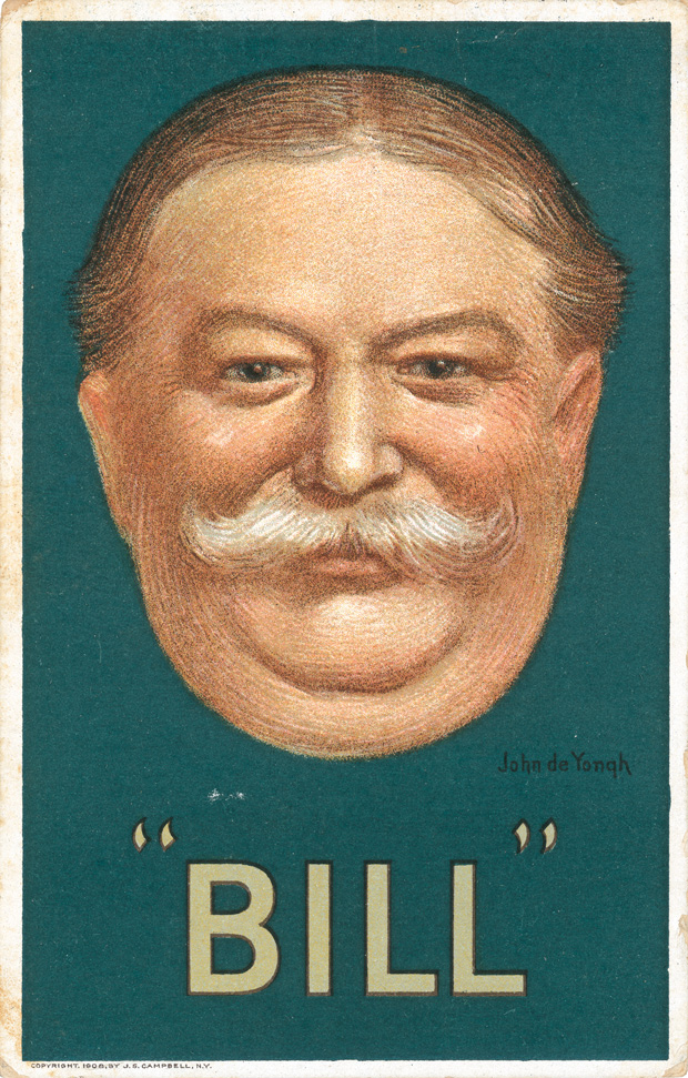
Another poster that follows the simplified design sense of early 20th century Europe is this poster for William H. Taft's campaign versus William J. Bryan in the 1908 presidential election. The poster is designed by John de Yongh (1856-1917) who shows similar style to plakatstil with the large flat background and flat color for the name bill.

This Socialist Party campaign poster for the 1904 election still shows exhibits design sense left over from the Victorian print.
A 1912 election poster for Theodore Roosevelt and Johnson uses a photo representation instead of an illustration.
Woodrow Wilson's America First posters which have the heroic imagery.
The fact is, it is very difficult to find any U.S. made campaign posters that truly exhibit a plakatstil, Sach plakat, or any modernist style of poster design... Then again.

Tuesday, October 30, 2012

A Glimpse of Klimt

A late happy birthday to Gustav Klimt who would have been 150 years old this year, 2012, on July 14th. In Austria they are celebrating the great contributor of the Vienna Secession all year round.

Gustav Klimt was born just outside Vienna in 1862 and was a student of School of Applied Arts in Vienna from 1876 to 1883. Trained in architectural painting, most of his early works were fairly conservative and most his commissions were for interior murals (Huffington).

In the late 1890's Klimt's work began to explore more symbolic motifs that were more "unconventional" for the times. His allegorical paintings were often seen as borderline pornographic and radical by critics (Huffington).  A good number of his drawings, paintings, and studies could still be considered pornographic by some as a lot of his focus was on the female nude. The majority his works were highly decorative and used gold leafing to a great magnitude.

Gustav Klimt - Water Serpents
His notable and recognizable work is the painting called The Kiss.
The Kiss, has been put on wallets, bags and even a print offered by Ikea. The painting shows a woman embraced by a man giving her a kiss, but some have argued the awkwardness of the angle of the woman's head, looking as if she has a broken neck.

It seems that Klimt had a sense for the macabre as some of his works explored allegories on life and death.
Gustav Klimt – Die hoffnung II
Gustav Klimt – Death and life


He became president of the Vienna Secession at the age of 35 in 1897 (Neue Galerie), leading a revolt against the Viennese Creative Artists Association (Meggs) and his highly stylized artwork leading an expressive way. He left the Secession in 1905, after a dispute with Josef Hoffman.

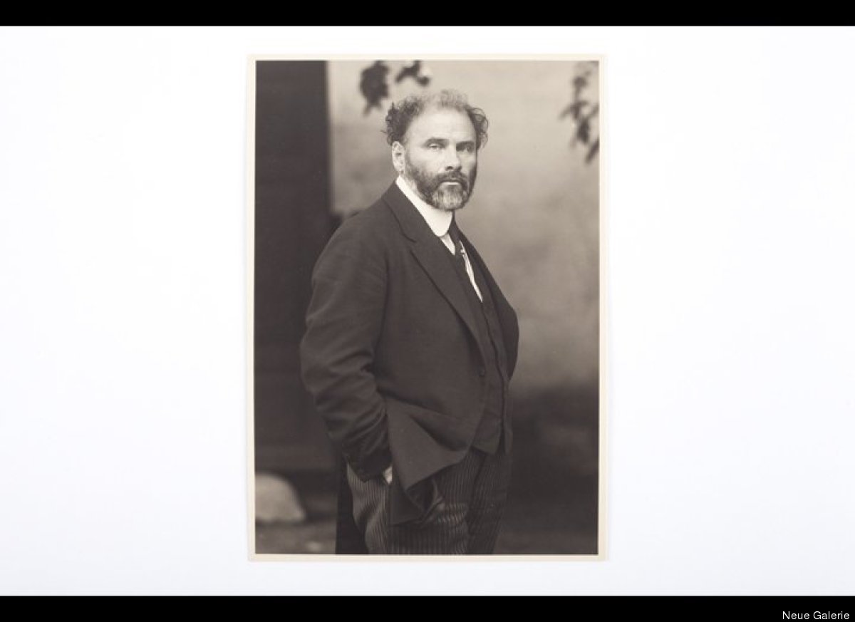
Later in life Klimt was often commissioned to do portraits liked to live secluded in his robe and sandals. He died  February 6, 1918 (Neue Gallerie).


Gustav Klimt, Vienna 1917
Photographer: Moritz Nähr (1859-1945)
Vintage silver print
Neue Galerie New York 
  
 A slide show of early photographs of Klimt can be found here:
 http://www.huffingtonpost.com/2012/07/14/gustav-klimt-birthday_n_1672351.html#slide=1224274
Sources:
Neue Galerie
Meggs History of Graphic Design
Huffington Post

Tuesday, October 23, 2012

He said, "Let's go Dutch." She said, "I don't like your type."

The image above is figure 10-32  of Meggs' History of Graphic Design, fifth edition. It is the first page of A. Roland Holst's, Deirdre en de Zonen van Usnach (Deidre and the Sons of Usnach), which was printed by, the Dutch typographer, Jan van Krimpen in 1920 at the Van Scherpenzeel in The Hague (Fridrichs). What interested me about the image was the beautiful woodcut image on the left page. It has elegant curvilinear lines that have a very organic feel balanced with almost solid black areas with very hard edges. The image contrasts very well against the large red capitals with a sweeping line coming off the O in the second line of the title text. It is what made me mark the image on my first flip through the book.

Open Roman Capitals
I really enjoyed the image as it seemed like a great transitional piece that marked the crossing over from The Arts and Crafts Movement to Art Nouveau, and I wanted to research the artist. Unfortunately, my results only returned the name B. Esser in which there was little to no information to be had within my immediate reach. However, I have found  quite a bit on Jan van Krimpen and will give some tidbits on his work.

Jan van Krimpen (1877-1958) was a type designer and typographer from Gouda, Netherlands who developed type for the Enschedé Foundry (Meggs). His list of fonts include Lutetia, Romanée, Open Roman Capitals, Romulus type family, VAn Dijck Roman, Haarlemmer, Sheldon, and Spectrum which are all cut type or designed for mono-type (Wikipedia). He was "originally been trained as a visual artist, but later on trained himself in calligraphy and the art of bookbinding, to publish his first book in 1917, the Sonnetten by his friend Albert Besnard (KB). His published books ave excellent examples of his types and capitols and his typography had a minimalist approach as he believed that typography had a beauty in itself.
Reproduced Spectrum
 Therefore, there are little to no use of images or flourishes in the books he has designed yet uses subtle embellishments on capitols. The rest of the text would remain plain. The capitols, van Krimpen would design and cut himself (KB).
Penthesileia. H. Marsman. Arnhem, Hijman, Stenfert Kroese en Van der Zande, 1925. 15, [1] p., 25 x 18 cm. (Palladium). Printed on the hand-press of Joh. Enschedé en Zonen. Edition of 160 copies. This copy has been printed for the KB. 163 D 28, p. 4-5


A. van Schendel, Verdichtsel van zomerdagen, Maastricht, Boosten & Stols

Jan van Krimpen's binding design of Aruthur van Schendel's Verdichtsel Van Zomer Dagen (1925) shows his elegant solutions by using a single flourish on the descender of the capital G into the negative space below.

Printers mark for The Halcyon Press


The printers mark for The Halcyon Press displays van Krimpen's Open Roman Capitals type used in a ligature. "First applied in R. M. Rilke, Les roses. De mark is used in (nearly) all publications of the Halcyon press as well as in a periodical of the same name, published in 1940-1942. In the early publications of the press the mark is printed with a double rectagular border" in 1927 (John Friedrichs).


Sources:
Meggs History of Graphic Design
The Early Work of Jan Van Krimpen, John Friedrichs 2011
Jan van Krimpen, Wikipedia
KB Koninklijke Bibliotheek. National Library of the Netherlands 


Tuesday, October 16, 2012

Letters Get Togethers


Specimen sheet By William Caslon  1732

My original topic was going to be on William Caslon because his cut type was the first in English and was used in the Declaration of Independence. But, as I began my research I noticed something curious about his fonts… ligatures. Ligatures are two or more letters connected together in succession and, in our day and age, are nearly only seen in trademarks, logos, or as a design aesthetic, and not as a part of the written language or built into the font itself. So be it, my research began to take a tangent into  ligatures came from.

The example to the right is a specimen sheet of William Caslon's letters and if you click on it you can see it in a large view. When you look through the sheet, you can see a lot of the various ligatures. For instance, in the second column, the third section down, you can see that Caslon cut ligatures for the letter combinations of ct, ft, ff, fq, fu, and ae. 


The John Baskerville specimen sheet also shows examples of ligatures such as the ae, the ft, and fl.

14th-century manuscript: Watriquet de Couvin's Fabliaux divers... (Paris, ca. 1330), a book of secular medieval French poetry.
Our Meggs book has countless examples of ligatures through out the images of typography yet also in illuminated manuscripts. It could look as if early typographers were merely mimicking the handy work of scribes. Scribes often ran the letters close together as a space saving device. Typographers, similarly created ligatures as a space saving device. "With the invention of Metal Movable Type in the 15th century, ligatures flourished and were a great time saver when setting type. For example, instead of having to set an “f” and an “i”, a single ligature block could be used instead. That may not seem like a great time saver, but when you’re setting an entire book 0f 40,000 words in movable type, then it could certainly make a difference" (I Love Typography).

So what happened to ligatures. According to I Love Typography, the inventions of typewriters and desktop publishing did away with them in the search of simplification. However they still do exist and see them more than we acknowledge.


Sources:

Tuesday, October 9, 2012

Stamp and date here please.


Akkadian, about 2250 BC

The early development of visual communication of man is surely an in-depth and interesting one. But, one of my main interests delves directly in to the creation of personal identities and how different civilizations of early Eastern and Western worlds tackled this problem. In today’s world, an individual simply put’s their signed signature on pieces of paper to signify ownership or approval of something. Yet, to make a signed piece a paper legally binding, it needs to be notarized or, more simply put, stamped by a notary official.
Uratian, 8th century BC

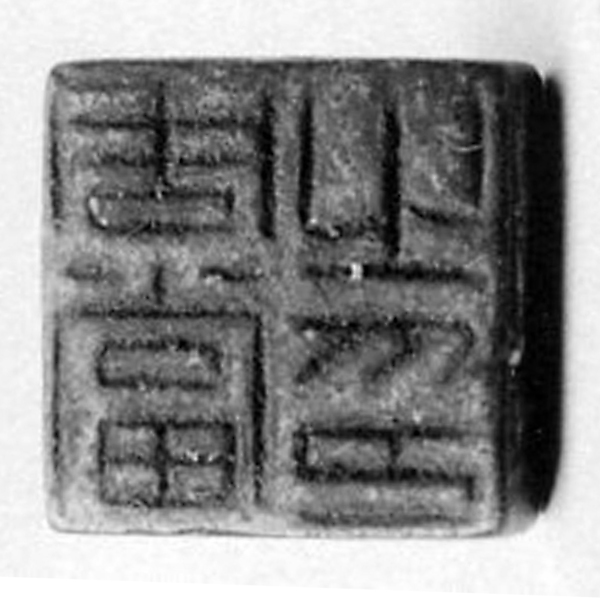
The idea of stamping something to signify ownership or approval is not a new one and in fact predates back to 3500 BC. Both, developing Western and Eastern civilizations created certain systems of stamping. Early Mesopotamians created a stamp-cylinder seal to imprint into clay as China developed a relief printing stamp using cinnabar ink called a chop. 

Stamp-cylinder seals were originally carved in stone with an image around and on the bottom of the cylinder that could be depressed in clay, and was often used as a stamp to certify documents and provide a way to prevent forgery (Meggs). The use of these cylinder seals continued until 300 BC (The British Musem).

Chinese Bronze Chop
Similarly, the Chinese developed the chop, a relief print usually carved into jade or ivory, during the third century to use as a way to certify a documents as well as art works (Meggs). They often served as a simpler way of a signature due to the complex nature of the written Chinese language. Chops are still used today.

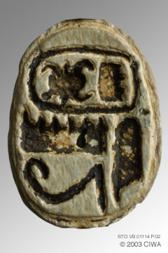
But stamps and seals continued to evolve from the two originals. Egyptian scarabs containing the the cartouche and hieroglyphic carvings were often a seal of he owner and worn as signet ring Meggs. The signet rings had the ability to leave an impression having the same ability to endorse legal documents. "Herodotus (I, 195) mentions that everyone in Babylonia carried a seal, and the same remark would apply with equal truth to Egypt" (Newberry).


Egypt, New Kingdom, Dynasty 18 


1570 BC–1298 BC
Lost Colony Signet Ring, 1585
  Signets transcended time. The Lost Colony Signet ring was discovered by David S. Phelps of East Carolina University in 1998 and dates back to back to 1585 (East Carolina University). This evidence shows the signet ring was used throughout the Medieval period. They were used in wax seals on legal documents and on letter envelopes.

Seals and stamps are still used today to show a legal binding document. If you have ever had to get a document notarized you should see a stamp similar to the one below.

 
Sources
Meggs