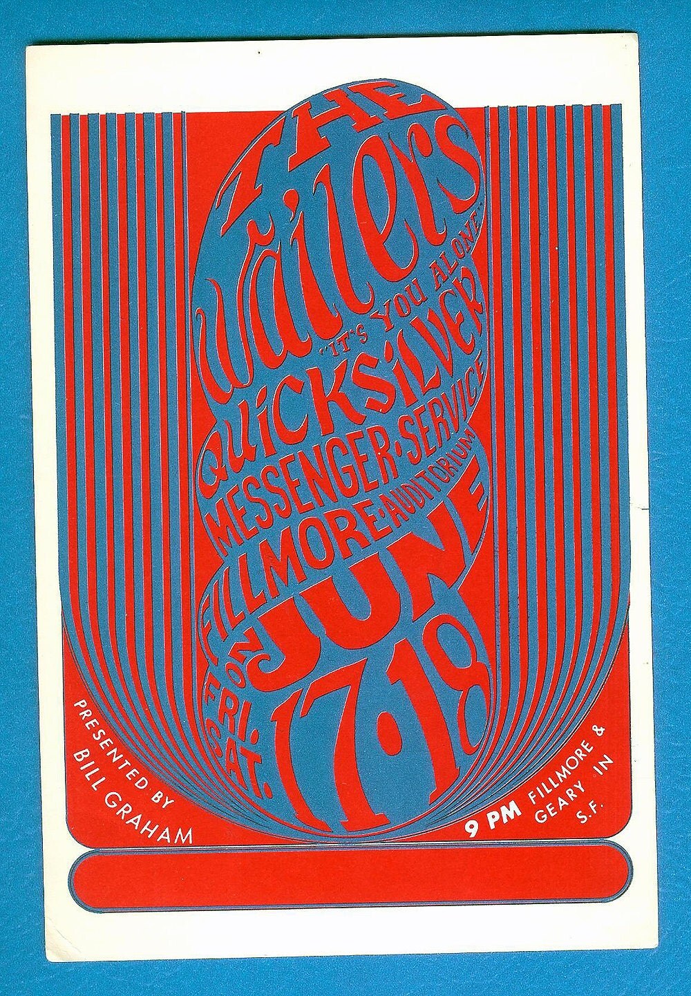
 The truth is, we are surrounded with conceptual images every
day. We are constantly deciphering images and juxtapositions which challenge us
into looking deeper. I thought psychedelic posters were interesting and part of
the kid that still lingers around inside me wants to delve into that world, but
now I see it as merely relative to a time. I understand how they represent the
significant era of “freedom and love” but something in me just says that they
were just a bunch of hippies ripping off art nouveau and adding in colors that
were “trippy.” I guess it is the
concept what is important here.
The truth is, we are surrounded with conceptual images every
day. We are constantly deciphering images and juxtapositions which challenge us
into looking deeper. I thought psychedelic posters were interesting and part of
the kid that still lingers around inside me wants to delve into that world, but
now I see it as merely relative to a time. I understand how they represent the
significant era of “freedom and love” but something in me just says that they
were just a bunch of hippies ripping off art nouveau and adding in colors that
were “trippy.” I guess it is the
concept what is important here.
What really caught my attention in the chapter about the
conceptual image are the works by Gunter Rambow (b.1938). His name got me
thinking of a certain movie war veteran that wreaked havoc through a small
town, but I digress. As a fan of M.C. Escher optical illusion drawings when I
was a kid, Rambow’s surreal manipulated photographs are hauntingly attractive
to me. Unlike the psychedelic posters where you are saying, “Is that text? What
does that say?” you become intrigued with Rambow’s imagery and wonder what the true
meaning is.

When looking at Rambow and Michael van de Sand’s S. Fisher-Verlag poster, there is a book
standing in a space. The book has a window on it with the sun shining through
so bright that it casts the light and shadow on the ground in front of the book
and does not let be scene what is beyond the window is not visible. Naturally, the image gives the impression that
the text contained in the book is the answer to what is beyond the window.
It is interesting to see Rambow’s work as it predates the
use of photo editing software like Adobe Photoshop. To see realistic looking
images in an unprecedented surrealistic manner by, what seems to be, a
painstakingly process of taking photographs, melding and layering them, and
then reshooting them, is almost unimaginable. Yet Rambow pulls it off with
great detail with highly thought provoking content.
 The poster, Utopie Dynamit is a great example of content
that challenges the viewer. The print was designed in 1976 and shows the
explosion and defragmentation of a corporate (the modern glass box) looking building.
Without context, the image suggests the destruction of the modern corporate architectural
identity and without a understanding the language it is written in, an English reading
viewer might decipher it as utopian ideals blowing up capitalistic ideals or a
capitalistic utopia is exploding. Viewing the image after the 9/11 gives the image
more of a terroristic identity. To understand the image we must understand the
context. The Utopie actually refers to a movement in Paris between 1967 and
1978 that included architects, socialists, and urbanists who protested the reform
of architectural education, the expansion and replanning of the Parisian urban
planning o Charles de Gualle, and the domestication of military and industrial
technologies. This information now gives some external knowledge about the
image and its meaning. Utopie was trying to combat the modernization of
architecture in favor for design that followed historical Paris.
The poster, Utopie Dynamit is a great example of content
that challenges the viewer. The print was designed in 1976 and shows the
explosion and defragmentation of a corporate (the modern glass box) looking building.
Without context, the image suggests the destruction of the modern corporate architectural
identity and without a understanding the language it is written in, an English reading
viewer might decipher it as utopian ideals blowing up capitalistic ideals or a
capitalistic utopia is exploding. Viewing the image after the 9/11 gives the image
more of a terroristic identity. To understand the image we must understand the
context. The Utopie actually refers to a movement in Paris between 1967 and
1978 that included architects, socialists, and urbanists who protested the reform
of architectural education, the expansion and replanning of the Parisian urban
planning o Charles de Gualle, and the domestication of military and industrial
technologies. This information now gives some external knowledge about the
image and its meaning. Utopie was trying to combat the modernization of
architecture in favor for design that followed historical Paris. Another of Ranbow’s iconic surreal book image is a poster
for S. Fisher with a light bulb superimposed as if it lives in a space inside
the book cover. The design implies that ideas are to be found inside the book
or sheds light on the subject.
Another of Ranbow’s iconic surreal book image is a poster
for S. Fisher with a light bulb superimposed as if it lives in a space inside
the book cover. The design implies that ideas are to be found inside the book
or sheds light on the subject.
“Sigh”… Conceptual design… so much fun.
A large amount of Gunter Rambow’s work can be found at www.gunterrambow.de
Sources
Meggs History of Graphic Design


&cropxunits=400&cropyunits=264&404=a404&maxwidth=314&watermark=)