Once again, my head has filled to the brim with facts and
fragments of the available knowledge the world has to offer. I am always amazed
about the amount if information people are able to store in that magical
computer called the human brain. I guess the saying goes, “the more you know,
the more you know you don’t know.” The compilation of research, insight, and investigation
found in this blog is my reaction to what I didn’t know and thanks to Megg’s History of Graphic, this graphic
design history class, and the blogs of all my fellow students participating in
this glorious exploration, I know how little I actually know. So, while I take
the time to defragment my brain, file all of this information in the proper
synapses, and make space for more information, please take a moment to enjoy my
blog.
Friday, December 7, 2012
A Reflection
The arduous task of tackling the history of graphic design
has led me to believe that there is no tackling the subject, of any sort. The information
of design is so vast and complex that it would take a lifetime to research and
absorb it all. Yet, in a brief twelve weeks I was able to obtain a glimpse of
what a large amount of important artists, typographers, and designers, as well as
early man and the developments of society, have contributed to the history of
graphic design. In my own investigations, I have learned how a handful of those
many successes have left their mark on the world. Much, much more is there to
be explored and I guess it’s a good thing that I have a lifetime left to enjoy
doing so.
Our textbook, Meggs’
History of Graphic Design, is quite the large book with plenty of color
filled pages of various works from posters to typographical samples. That does
not mean that this book was easy to get through. The text is rather dense.
Philip B. Meggs and Alston W. Purvis’ delivery and writing style, although
packed with information, is very dry and can be difficult at times. I
understand that the five pound book is meant for academic purposes, yet I feel
the flow of the book has a stop and go attitude. Meaning, it gives you a little
information of one person then stops and starts on another person and then
stops. This pattern continues throughout the book and took some time to get
used to. I almost felt I would be better served by a list of names with their
contributions listed next to them. The dense reading often led me to take naps
in between sections in order to compound the information, recharge and have
another go. My naps helped me enjoy they process a lot more as I am intrigued in
all the information that Meggs’ has to offer and I do realize that text is only
a beginning to exploration.
My exploration, thus far, has brought me a great learning
experience, about graphic design and about myself. I have learned that having a
greater knowledge of history can expand my breadth of what I am capable of. Understanding
different styles and different schools of art will help me in a applying an appropriate
aesthetic and graphic solution to a specific problem and that there are
multiple solutions to solve those problems.
This history is there to guide us and show us the rules and
how the rules were made so as contemporary designers we can, not break the
rules but, expand them and add to them and create something which contributes
to our society. It is important to understand that design is our surrounding
environment and our lives are completely submersed in it. It is more important
that we recognize the designs that surround us and why that laptop in front of
you has those subtle curves and lines.
I have also learned that I am capable of writing a small
book about graphic design. I believe I have written more pages for this class
than I have ever before, which is a truly remarkable accomplishment for myself.
I have realized I have much to explore.
There are many
subjects of design like Bauhaus and Constructivism that have peaked my interest
and Meggs has merely given us a snippet. I now have a new quest to find books
that many these designers have written about theories and ideas that are sprung
from their own experimentations with design.
I stated at the beginning of this blog and at the start of
this course, I stated that I planned on enjoying it and I did. I am not going
to say I didn’t get frustrated at times because at points I had to remind
myself, “just enjoy it.” For the greater part, learning about cave art, to the
development of the alphabet, to the introduction of typography, art nouveau,
Bauhaus, punk, digital art, etc. has been thoroughly enjoyable.
Tuesday, December 4, 2012
Info Here, There, Everywhere
Simply put, I am in awe. Two words - environmental graphics.
A lot of times we do not realize how much we are surrounded by graphic design
in the areas we visit. When we travel the world, a new city, or even when we
walk down the street, we are completely engulfed in environmental graphics
whether it is simple street signs or an elaborate corporate design scheme that
screams for attention.
 In our travels through Megg’s History of Graphic Design we
were introduced to the ideas of environmental graphics by the use Edward
Johnston’s London Underground logo in conjunction with Henry C. Beck’s London
Underground subway maps. Trains and stations were also painted to match the
colors of the logo. The placement of these elements in subways and marking the
subway entrances not only helped locate and move about the subway systems, but
contributed to the overall branding of the subway line. The Underground
continues to have a vibrant identity.
In our travels through Megg’s History of Graphic Design we
were introduced to the ideas of environmental graphics by the use Edward
Johnston’s London Underground logo in conjunction with Henry C. Beck’s London
Underground subway maps. Trains and stations were also painted to match the
colors of the logo. The placement of these elements in subways and marking the
subway entrances not only helped locate and move about the subway systems, but
contributed to the overall branding of the subway line. The Underground
continues to have a vibrant identity. The same type of environmental graphics ate depicted in
sources of transportation and traffic signage. Robin Cook and Don Shanosky
designed the set of glyphs for the Department of Transportation in 1974 to give
information to an international audience, transcending language and literacy
barriers. Street signs and traffic
signage have been designed to be easily read and to give appropriate direction
yet many small towns and cities will develop street signs that are distinct
from their neighboring city. For example; Mountain View, California uses a municipal
blue or a forest green sign with a standard san serif font. The green and blue signs
have a suburban urban motif being closer to a metropolitan area. You will know when you have left Mountain View
and have entered Los Altos, California when your street signs turn from blue to
brown and use an italicized sans serif font in all capitals. The brown color of
Los Altos’ signs are significant of national park signs and emphasize the city’s
more wooded environment.
The same type of environmental graphics ate depicted in
sources of transportation and traffic signage. Robin Cook and Don Shanosky
designed the set of glyphs for the Department of Transportation in 1974 to give
information to an international audience, transcending language and literacy
barriers. Street signs and traffic
signage have been designed to be easily read and to give appropriate direction
yet many small towns and cities will develop street signs that are distinct
from their neighboring city. For example; Mountain View, California uses a municipal
blue or a forest green sign with a standard san serif font. The green and blue signs
have a suburban urban motif being closer to a metropolitan area. You will know when you have left Mountain View
and have entered Los Altos, California when your street signs turn from blue to
brown and use an italicized sans serif font in all capitals. The brown color of
Los Altos’ signs are significant of national park signs and emphasize the city’s
more wooded environment. 
 In our current era of the “digital revolution,” environmental
graphics has become extremely bold especially with the addition of digital
color sign boards and large, thin and color LED screens. Lisa Strausfeld’s
display for Bloomberg L.P. headquarters in New York is an amazing info graphics
demonstration in using digital boards to present a dynamic display of financial
information. The same style of info graphics displays are becoming common spectacles
for sporting arenas and events. They create dazzling visuals and re-enforce the
high energy of a given event. The HP Pavilion, used for the Sharks NHL hockey
team, uses continuous digital screen that spans the inner circumference of the
arena, infusing the interior with color and light to bolster and influence
crowds while re-enforcing the HP and Sharks brand.
In our current era of the “digital revolution,” environmental
graphics has become extremely bold especially with the addition of digital
color sign boards and large, thin and color LED screens. Lisa Strausfeld’s
display for Bloomberg L.P. headquarters in New York is an amazing info graphics
demonstration in using digital boards to present a dynamic display of financial
information. The same style of info graphics displays are becoming common spectacles
for sporting arenas and events. They create dazzling visuals and re-enforce the
high energy of a given event. The HP Pavilion, used for the Sharks NHL hockey
team, uses continuous digital screen that spans the inner circumference of the
arena, infusing the interior with color and light to bolster and influence
crowds while re-enforcing the HP and Sharks brand.
Tuesday, November 27, 2012
Father of Rambo(w)
 The truth is, we are surrounded with conceptual images every
day. We are constantly deciphering images and juxtapositions which challenge us
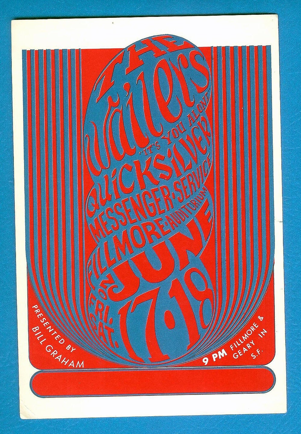
into looking deeper. I thought psychedelic posters were interesting and part of
the kid that still lingers around inside me wants to delve into that world, but
now I see it as merely relative to a time. I understand how they represent the
significant era of “freedom and love” but something in me just says that they
were just a bunch of hippies ripping off art nouveau and adding in colors that
were “trippy.” I guess it is the
concept what is important here.
The truth is, we are surrounded with conceptual images every
day. We are constantly deciphering images and juxtapositions which challenge us
into looking deeper. I thought psychedelic posters were interesting and part of
the kid that still lingers around inside me wants to delve into that world, but
now I see it as merely relative to a time. I understand how they represent the
significant era of “freedom and love” but something in me just says that they
were just a bunch of hippies ripping off art nouveau and adding in colors that
were “trippy.” I guess it is the
concept what is important here.
What really caught my attention in the chapter about the
conceptual image are the works by Gunter Rambow (b.1938). His name got me
thinking of a certain movie war veteran that wreaked havoc through a small
town, but I digress. As a fan of M.C. Escher optical illusion drawings when I
was a kid, Rambow’s surreal manipulated photographs are hauntingly attractive
to me. Unlike the psychedelic posters where you are saying, “Is that text? What
does that say?” you become intrigued with Rambow’s imagery and wonder what the true
meaning is.

When looking at Rambow and Michael van de Sand’s S. Fisher-Verlag poster, there is a book
standing in a space. The book has a window on it with the sun shining through
so bright that it casts the light and shadow on the ground in front of the book
and does not let be scene what is beyond the window is not visible. Naturally, the image gives the impression that
the text contained in the book is the answer to what is beyond the window.
It is interesting to see Rambow’s work as it predates the
use of photo editing software like Adobe Photoshop. To see realistic looking
images in an unprecedented surrealistic manner by, what seems to be, a
painstakingly process of taking photographs, melding and layering them, and
then reshooting them, is almost unimaginable. Yet Rambow pulls it off with
great detail with highly thought provoking content.
 The poster, Utopie Dynamit is a great example of content
that challenges the viewer. The print was designed in 1976 and shows the
explosion and defragmentation of a corporate (the modern glass box) looking building.
Without context, the image suggests the destruction of the modern corporate architectural
identity and without a understanding the language it is written in, an English reading
viewer might decipher it as utopian ideals blowing up capitalistic ideals or a
capitalistic utopia is exploding. Viewing the image after the 9/11 gives the image
more of a terroristic identity. To understand the image we must understand the
context. The Utopie actually refers to a movement in Paris between 1967 and
1978 that included architects, socialists, and urbanists who protested the reform
of architectural education, the expansion and replanning of the Parisian urban
planning o Charles de Gualle, and the domestication of military and industrial
technologies. This information now gives some external knowledge about the
image and its meaning. Utopie was trying to combat the modernization of
architecture in favor for design that followed historical Paris.
The poster, Utopie Dynamit is a great example of content
that challenges the viewer. The print was designed in 1976 and shows the
explosion and defragmentation of a corporate (the modern glass box) looking building.
Without context, the image suggests the destruction of the modern corporate architectural
identity and without a understanding the language it is written in, an English reading
viewer might decipher it as utopian ideals blowing up capitalistic ideals or a
capitalistic utopia is exploding. Viewing the image after the 9/11 gives the image
more of a terroristic identity. To understand the image we must understand the
context. The Utopie actually refers to a movement in Paris between 1967 and
1978 that included architects, socialists, and urbanists who protested the reform
of architectural education, the expansion and replanning of the Parisian urban
planning o Charles de Gualle, and the domestication of military and industrial
technologies. This information now gives some external knowledge about the
image and its meaning. Utopie was trying to combat the modernization of
architecture in favor for design that followed historical Paris. Another of Ranbow’s iconic surreal book image is a poster
for S. Fisher with a light bulb superimposed as if it lives in a space inside
the book cover. The design implies that ideas are to be found inside the book
or sheds light on the subject.
Another of Ranbow’s iconic surreal book image is a poster
for S. Fisher with a light bulb superimposed as if it lives in a space inside
the book cover. The design implies that ideas are to be found inside the book
or sheds light on the subject.
“Sigh”… Conceptual design… so much fun.
A large amount of Gunter Rambow’s work can be found at www.gunterrambow.de
Sources
Meggs History of Graphic Design
Tuesday, November 20, 2012
How Symbolic.
 The “International Typographic Style,” is discussed in
chapter eighteen of Meggs’ History of Graphic design as a typographic style,
derived from Swiss designers, which influenced design across the Western World.
However, this typographic style did not communicate across a truly
international audience without the introduction of pictograms.
The “International Typographic Style,” is discussed in
chapter eighteen of Meggs’ History of Graphic design as a typographic style,
derived from Swiss designers, which influenced design across the Western World.
However, this typographic style did not communicate across a truly
international audience without the introduction of pictograms.
Originally introduced during the Bauhaus were Gerd Arntz and
Otto Neurath’s isotype pictographs. These pictographs used simple symbolic
images used to convey certain amounts and types of people in graphic manner. In
the way they were used, a supplemental text was needed in order to show the
context of the information presented. With influence of modern design including
Bauhaus and the Swiss’ International Typographic Style, the United States
Department of Transportation commissioned the American Institute of Graphic
Arts in 1974 to create a set of symbols, which could transcend language barriers.
A true international visual language was born from this project and can be seen
all over the world, with slight modifications to accommodate differences in
languages. The Olympic Games have also repeated the use of pictographs in order
to surpass language barriers by having symbolic images represent different
types of sports.
 |
| National Parks Symbols |
| Department of Transportation Symbols |
The use of the pictogram is ever so present in our modern
society. We are bombarded with them on a daily basis whether we go to the
airport, school, or the mall. We find them as icons on our “smart phones” and
as playful images on t-shirts. They are easily recognizable and quick to
register in our brains, but is this really a good thing? Could the constant
use, or over use of pictograms be dumbing the population down?

 |
| Scene from Idiocracy 2006 |
Meggs History of Graphic Design
AIGA
lardbiscuit.com
IMDB
wikipedia.org - Mike_Judge
Subscribe to:
Comments (Atom)